Please give a short reason for your vote and keep tally!
Kisoku. 
Mini100. 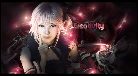
Edited by mini100, 28 May 2015 - 17:56.
Posted 21 May 2015 - 00:32
Please give a short reason for your vote and keep tally!
Kisoku. 
Mini100. 
Edited by mini100, 28 May 2015 - 17:56.
Sorry but Photobucket decided to take down my Signature.
Posted 21 May 2015 - 01:37
A-1
B-0
The render in B contrasts a lot from the rest of the sig, and not in a good way, that it doesn't blend in. It'd look nicer if there were more color filters, a clear flow, and less manipulation of the C4D's in the background (if they are C4Ds). I'd also prefer the text to be smaller.
In A, personally I'd have put the text slightly closer, but it's not an issue right now. However, the background on the left of the render is different from the right side, making it rather weird. Good job with blending the render in though, choosing complementing colors and blurring in the right spots.
Edited by Shiver, 21 May 2015 - 01:41.

Posted 21 May 2015 - 02:16
A - Brave render placement. Very nice choice of font. There is literally no lighting and depth in the sig, however if you're trying to implement a different pattern-oriented style (which I think you are?) you want to make it cleaner. Background is a bit of a mess. No symmetry. I suggest reading up on this : http://en.wikipedia....talt_psychology
And implementing them whenever possible. You're improving though.
B - I agree with above that the contrast between the background and render is a bit off. A colour filter or simply toning down the saturation might help? idk. I love the flow you've created with the background but I'm not sure it complements the render, if that even makes any sense? Too many light sources and dark spots for my liking but that's just me, I think your style is pretty distinctive and cool tbh.
B gmv.
A-1
B-1
Posted 21 May 2015 - 04:56
A - Great work on the blending, render placement is a bit off though and there's no clear flow. You should really make a solid background first and build from there. The colors are a bit dull also, needs contrast and lighting.
B - Very different and somewhat confusing, but I love the colors, lighting and depth in it.
B gmv
A-1
B-2
Edited by SlntScream, 21 May 2015 - 04:57.

Posted 22 May 2015 - 12:57
A - I find background too boring. I'd like to see more colours or higher contrast.
B - It's kind messy but I still like this one more.
A-1
B-3
Posted 24 May 2015 - 18:59
A-1
B-4
A- the backgound is far to light, I don't think that the background goes very well with the render. I like to see color and I don't see to much of it because of how light everything is. The txt looks nice I like how its placed. the render looks nice.

B. 
B- This looks great all around the back ground amazing the colors are beautiful the render and effects are very nice, great pick of txt. This is a very nice sig. great job to you.

Keep on loven.
Posted 25 May 2015 - 19:16
A-1
B-5
B GMV. The render is clearly difficult to work with since it has no flow at all.I think there is room for improvement in both but B has made a better choice with the render placement and lighting.
Posted 28 May 2015 - 17:56
The winner is Mini100. Good job Kisoku and thank you for the battle.
Sorry but Photobucket decided to take down my Signature.
0 members, 0 guests, 0 anonymous users