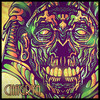
Hello all! I just made my first ACTUAL not bad avatar and sig combo. check it out, let me know what you think!
Oh and bid on it or them all you want! ill end the auction on october the 13th


Posted 09 October 2013 - 11:07
Hello all! I just made my first ACTUAL not bad avatar and sig combo. check it out, let me know what you think!
Oh and bid on it or them all you want! ill end the auction on october the 13th
Posted 09 October 2013 - 21:51
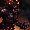
Great combo. Everything looks fine in my eyes except for her arm. Seems too smudged around there but besides that they're good pieces
~ ~ ~ ~ ~ ~ ~ ~ ~ ~ ~ ~ ~ Live. Love. Learn. Die. ~ ~ ~ ~ ~ ~ ~ ~ ~ ~ ~ ~ ~
Are you an artist? Want to be listed as one under the Artist Directory; click here
Posted 09 October 2013 - 22:59
Great combo. Everything looks fine in my eyes except for her arm. Seems too smudged around there but besides that they're good pieces
thank you for your feedback  it means a lot to me!
Posted 11 October 2013 - 00:48
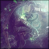
This is a very good combo. Especially if you are just not getting the hang of it. However, Something most artists struggle with is "Focus"
Adding the white around the render helps draw attention to Ivy however the fractals on each side have a tid bit of white around them as well. Typically with a light source around your render you would want to make the edges of the piece a bit darker as to help draw in the viewer. Overall its a solid 8/10. With her chest area being white the focus is already pretty high but the darker edges in the sig would have helped. The avatar is a solid 9/10
Very good job though. I am impressed. Reminds me of TreeFrog and that is about the best compliment I can give you

So who wants to buy me Zombie Brand on League of Legends?
Posted 11 October 2013 - 04:32
I appreciate the compliment, but I'm not what I use to be and I dont think I ever was what I think you think I was. And now I've confused myself lol.
Now, on to the matter at hand. Chagryn brings up an excellent point about focus. Its always important to keep in mind, while you're making it, what you what the viewer's eye drawn to. You did a great job in the avatar, my eye is immediately drawn to Ivy. The sig on the other hand is a bit conflicted on the focus. By sharpening all the green effects you have brought them to the same plane as Ivy and distinguished them from the rest of the bg. This is a great technique for adding depth and its one I use often, but you have to be careful because, as we can see in this piece, the effects stretch all the way to either edge of the sig. This causes the eye to shift around trying to decide on what to look at. This can be fixed by adding some kind of flow or sense of motion to the effects so that the eye is drawn across the piece naturally. Other than that there are some minor things I would clean up like the partially erased light circle still on Ivy's head, maybe get rid of some of the noise in the effects(parts seem a bit over sharpened), use photofilters and g-maps to help balance the colors. And of course, what I say to every one, it needs shading. Shading, shading, shading. 3 light sources and nothing is making a shadow? C'mon.
All that being said, this is solid work, and you definitely have potential. Keep it up.

^ SAHARDY ^
<><><><><><><><><><><><><><><><><><><><>< Selling Stuff ><><><><><><><><><><><><><><><><><><><><>
Posted 12 October 2013 - 04:49
3 main things could improve this piece tremendously;
1: a light source
2: more fields of depth
3: slightly darkening the edges of the canvas.
Solid work but plenty of room to improve
Keep at it! 

Posted 12 October 2013 - 13:15
3 main things could improve this piece tremendously;
1: a light source
2: more fields of depth
3: slightly darkening the edges of the canvas.
Solid work but plenty of room to improve
Keep at it!
Glad to hear these comments. Good job Revi
I appreciate the compliment, but I'm not what I use to be and I dont think I ever was what I think you think I was. And now I've confused myself lol.
Now, on to the matter at hand. Chagryn brings up an excellent point about focus. Its always important to keep in mind, while you're making it, what you what the viewer's eye drawn to. You did a great job in the avatar, my eye is immediately drawn to Ivy. The sig on the other hand is a bit conflicted on the focus. By sharpening all the green effects you have brought them to the same plane as Ivy and distinguished them from the rest of the bg. This is a great technique for adding depth and its one I use often, but you have to be careful because, as we can see in this piece, the effects stretch all the way to either edge of the sig. This causes the eye to shift around trying to decide on what to look at. This can be fixed by adding some kind of flow or sense of motion to the effects so that the eye is drawn across the piece naturally. Other than that there are some minor things I would clean up like the partially erased light circle still on Ivy's head, maybe get rid of some of the noise in the effects(parts seem a bit over sharpened), use photofilters and g-maps to help balance the colors. And of course, what I say to every one, it needs shading. Shading, shading, shading. 3 light sources and nothing is making a shadow? C'mon.
All that being said, this is solid work, and you definitely have potential. Keep it up.
This is a very good combo. Especially if you are just not getting the hang of it. However, Something most artists struggle with is "Focus"
Adding the white around the render helps draw attention to Ivy however the fractals on each side have a tid bit of white around them as well. Typically with a light source around your render you would want to make the edges of the piece a bit darker as to help draw in the viewer. Overall its a solid 8/10. With her chest area being white the focus is already pretty high but the darker edges in the sig would have helped. The avatar is a solid 9/10
Very good job though. I am impressed. Reminds me of TreeFrog and that is about the best compliment I can give you
Thank you all for your great feedback! i will try my hardest to make the slightest changes possible in my future works! 
0 members, 0 guests, 0 anonymous users