Please keep tally and leave a short explanation for your vote.
Athdenald.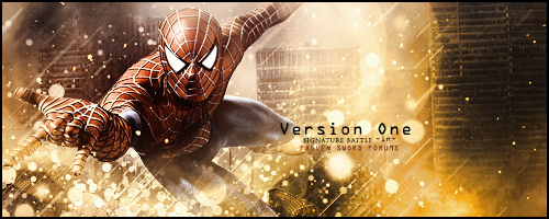
Mini100.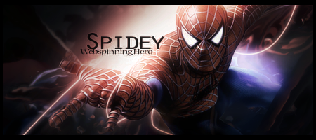
Edited by mini100, 06 June 2015 - 20:06.

Posted 29 May 2015 - 22:35
Please keep tally and leave a short explanation for your vote.
Athdenald.
Mini100.
Edited by mini100, 06 June 2015 - 20:06.
Sorry but Photobucket decided to take down my Signature.
Posted 29 May 2015 - 22:49
Both are incredible pieces! Absolutely fantastic! Tough decisions ahead.
A:0
B:1
A incorporates the city background which is a plus for when it comes to Spidy. Love the effects used cause it's something i would attempt to do but wouldn't come out as good as that. 8/10
B is straight up awesome. Flawless execution of everything, but the major factor for me was the the pen tooling. 9/10
~ ~ ~ ~ ~ ~ ~ ~ ~ ~ ~ ~ ~ Live. Love. Learn. Die. ~ ~ ~ ~ ~ ~ ~ ~ ~ ~ ~ ~ ~
Are you an artist? Want to be listed as one under the Artist Directory; click here
Posted 29 May 2015 - 23:42
A - 0
B - 2
A - Artist went a bit overboard with the brushing/stock of the circles, making it rather distracting. Render should also have been blended more around legs. Nice choice of background, as ghetoghost had mentioned though.
B - Perfect lighting and blending, although I wish that there was a bit more in the background and the pen tooling gone. Personally, pen tooling around/on renders should only be used for certain lighting effects and never to help with flow.

Posted 30 May 2015 - 00:06
B GMV
Both pieces are amazing quality, this is definitely the best signature battle since it's been back!
With A, I see a lot of potential. Would've loved to see a vintage style texture to this piece...but that's just me..I like what the artist has done, but I think the yellow is too overpowering. Sure, contrast is good but it takes your focus from spidey in this sig. The blending is perfect though, I wish I could blend like that!
B is almost flawless - the blending, the lighting behind the render is superb. Personally love the pentooling and subtle smudge effects (?) in the background. Text is poor tbh, it's WAY too big and overstated. Otherwise an excellent signature tho.
A-0
B-3
Posted 06 June 2015 - 20:05
Thanks! you too!
Sorry but Photobucket decided to take down my Signature.
0 members, 1 guests, 0 anonymous users