1A: 8
I'm not really liking the contrasting colors between the blue and the red/green on the left, and there's a random strand of green light towards the left that's just irritating me for some reason. Still, it's a nice piece overall, but I just think the flood could have been slightly smaller and you could've had a shallower contrast in colors.
1B: 9
The debris from the tornado is nice, but the tornado itself is sort of bugging me, just a slight bit sharper/more detailed (maybe some lines across it) would've made it slightly more effective imo. The house is also nice, but I'm just thinking that with a tornado in the background (and the light seemingly behind it), and with the way the house is angled, that the light should be towards the left (back) side of the house, not the place it currently is. I really do like the black and white though, I feel that really helps tie the piece together.
2A: 9
Overall, a pretty decent piece, but I'd have to say that for next time, make sure to use more colors in the piece. While having too many varying colors would have degraded the piece, adding in some other shades of blue/green as part of a nebula to fill the background could have been more effective. The fire effect was done pretty nicely, and it does look like a planet is exploding, but the edges around the planet itself (where the explosion is happening) could use a little refinement.
2B: 8
I can't really seem to tell if there is any background there behind all of the fire, though maybe it's just the way my monitor is set up. I think the trees that are in the background should have been slightly more visible (to sell the effect of a burning forest vs a bunch of fire), but the brush burning in the front does help. I would say that the fire should have been slightly more uniform (being really picky here since it's the largest part of the piece), in that they all should have been of somewhat uniform brightness variation (ie. bright in the center and darker/more saturated towards the top), but that's not really significant. I'm not really feeling the river towards the right hand side, because I just don't think that belongs in a fire piece

. Overall though, it's a nice photomanipulation. Maybe lose the deer for next time.
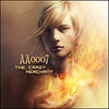
3A: 5
I might be a little more harsh than fair, but being compared to the two fire pieces above, I think the fire effects really don't work well enough. I think that the piece overall is way too bright, and that the sparks at the top are a bit unrealistic (magma is closer to fire color than lightning). that being said, I do still like the use of the lightning and fire stocks, I just think that the fire should have been concentrated to just the top of the volcano (and a little falloff), and the lightning should've been the majority of the background. Also, the text could use a little bit of work, I think it's a bit too wide and tall. Still, a nice concept, just the execution could've been a little bit better.
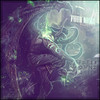
3B: 3
I also did a reverse image search (as suggested by a friend), and I did find the original stock. When compared to this piece, all I really see is a little bit of rain and a face, with some green abstraction. That being said, I think it would've been a lot better without the face, I'm just not really sure what a face is doing next to a tornado ... and thinking about how big that face would have to be .. also, the text might've benefited from a clipping mask. The biggest thing was the fact that I could find it on a reverse image search though :|.
Edit: Guys, don't kill me please
.


 Athdenald
 Grimmhawk
 aa0007
 Cassafras
 Beastboy95
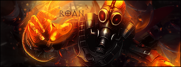
 Roan
Roan


