Jump to content

Photo

AotW/SotW #2 - Voting


  • Please log in to reply
10 replies to this topic

#1 Roan

Roan

    Veteran

  • Members
  • PipPipPip
  • 6,278 posts
  • Badge

Posted 23 September 2014 - 03:16

Time to vote for the SotW and the AotW!


You must chose your favorite avatar and your favorite signature.

Please give a short reason why you choose that one.


Group 1 - Avatar (only one entry, so this is for show off only)


A- Crzy-Avatar_zps8c9db36e.png


Group 2 - Signatures


A- Hayabusu-Signature_zps89e74314.png


B- flamer101-Signature_zps24b236ce.png


C- Crzy-Signature_zpsa0190b14.png


D- SlntScream-Signature_zpsb4a9723d.png


E- chagryn-signature_zps8ee363b5.png


Edited by Roan, 25 September 2014 - 21:18.

Firesinged_zpsd6b00c6e.png


#2 ghetoghost

ghetoghost

    Veteran

  • Members
  • PipPipPip
  • 1,564 posts

Posted 23 September 2014 - 14:23

Since only one avatar i'll CnC it (hope its okay):

It seems blah. Feels like its Naruto thrown onto a Japanese background with some out of place c4d. It's not bad but could be touched up a bit


A -

B - 1

C -

D -


It's between A,B,D. All three are great pieces but only one can get my vote.

A is pretty cool but the tongue seems to be going through his head rather than around his head.

B is simple and amazing. It feels special.

D is something awesome 

I vote for B for its simplicity and uniqueness 


Edited by ghetoghost, 25 September 2014 - 14:23.

~ ~ ~ ~ ~ ~ ~ ~ ~ ~ ~ ~ ~ Live. Love. Learn. Die. ~ ~ ~ ~ ~ ~ ~ ~ ~ ~ ~ ~ ~


Are you an artist? Want to be listed as one under the Artist Directory; click here


#3 clock96

clock96

    Veteran

  • Members
  • PipPipPip
  • 880 posts
  • Badge

Posted 23 September 2014 - 16:10

About the avi, feels like something is missing not sure what it is but its good overall, could have been better but its good.

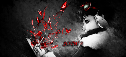
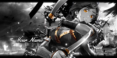
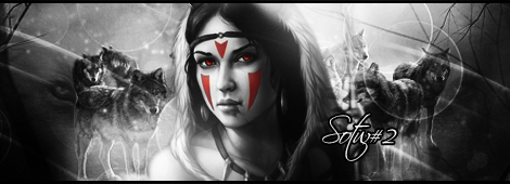
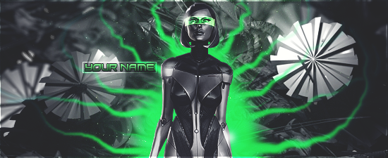
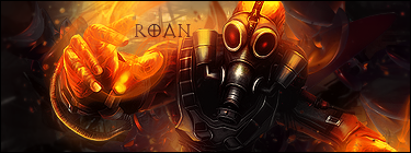
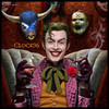
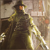
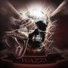
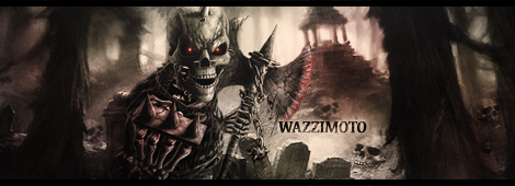
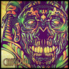
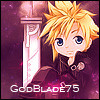
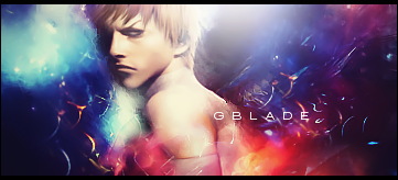
About the sigs, Sick pieces, very awesome pieces, all of them, was hard to choose butcI eliminated B though its cool but compared to the other pieces its least between them, awesome piece though, A : very very awesome, want to know the name of the font cuz I like it :) and want to use it, also the brushes used in it, vvey cool, C: very cool, liked the background and it feels like the render has life in it and the background fits in, D: very good too, seems classy, only thing is that the circles in the background seem like bubbles, they aren't bubbles but seem like bubbles, they would be cool in another sig and want to knoe the name of the brushes and those lines like in it, really cool but circles ruined it a very tiny little small bit, I thought about giving it my vote, hard choice A, C and D are really cool, hopped I can vote for all but my vote goes to C

Overall votes tally till now:-

A-
B- 1
C- 1
D-

clock96.gif


#4 mimdala

mimdala

    Member

  • Members
  • PipPip
  • 390 posts

Posted 23 September 2014 - 17:44

I vote for A, because I think the lighting works the best.


A- 1

B- 1

C- 1

D-


mimdala_zps719aa5bc.png


#5 Pix3

Pix3

    Member

  • Members
  • PipPip
  • 66 posts

Posted 24 September 2014 - 16:43

Voting for B. I just like how the butterflies make the image come alive. Cleverly placed coloring :) Dislike the text though, on all of them. 


A- 1

B- 2

C- 1

D-


#6 wazzimoto

wazzimoto

    Member

  • Members
  • PipPip
  • 300 posts
  • Badge
  • Canada

Posted 24 September 2014 - 21:47

B....like the color and the way the butterflies look almost 3-D......


                        aUcTiOnS  ---->   Check out my current auctions here!


                             WazziSig1_zps86dd99f5.png


#7 Chagryn

Chagryn

    Veteran

  • Members
  • PipPipPip
  • 995 posts
  • Badge

Posted 25 September 2014 - 06:33

Just noticed mine wasn't posted lol. Maybe you didn't get it, my bad. My vote goes for C. Excellent usage of attractive dynamic color. Great entries guys


BrandSig_zpsf2e5098b.png

So who wants to buy me Zombie Brand on League of Legends? 


#8 Roan

Roan

    Veteran

  • Members
  • PipPipPip
  • 6,278 posts
  • Badge

Posted 25 September 2014 - 21:17

Missed Chagryn's message!

If you want to vote for it and already voted, you may change your vote!

Remember voting for the graphic and not the artist! :) Anyways they are no prize!


Keep tally please!

A-1

B-3

C-2

D-0


Firesinged_zpsd6b00c6e.png


#9 Wesleysdf

Wesleysdf

    Veteran

  • Members
  • PipPipPip
  • 4,011 posts

Posted 27 September 2014 - 04:21

A-2

B-3

C-2

D-0


A GMV.

Flow: Splatters, render positioning, lighting;

Depth: pretty nice tiny white dots;

Not to mention the well done focal point that distracts from the text typography that could be better :P


#10 Godblade75

Godblade75

    Veteran

  • Members
  • PipPipPip
  • 2,417 posts

Posted 28 September 2014 - 02:21

I'll go with E, mostly just because I like the feel of it. Solid depth, though I'm not sold on the text.


A-2

B-3

C-2

D-0

E-1


godblade.png


#11 Roan

Roan

    Veteran

  • Members
  • PipPipPip
  • 6,278 posts
  • Badge

Posted 29 September 2014 - 21:46

Group 1 - Avatar (only one entry, so this is for show off only)


A- Crzy

 Crzy-Avatar_zps8c9db36e.png


Group 2 - Signatures


A- Hayabusu

 Hayabusu-Signature_zps89e74314.png


B- flamer101

 flamer101-Signature_zps24b236ce.png


C-  Crzy

Crzy-Signature_zpsa0190b14.png


D- SlntScream

SlntScream-Signature_zpsb4a9723d.png


E- chagryn

chagryn-signature_zps8ee363b5.png


CONGRATULATIONS to flamer101 for the win!


Edited by Roan, 29 September 2014 - 21:47.

Firesinged_zpsd6b00c6e.png


0 user(s) are reading this topic

0 members, 0 guests, 0 anonymous users

Font:
Arial | Calibri | Lucida Console | Verdana
 
Font Size:
9px | 10px | 11px | 12px | 10pt | 12pt
 
Color: