

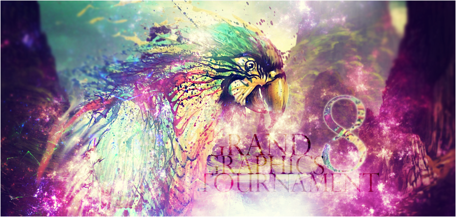
Welcome to the 8th Grand Graphics Tournament -- ROUND 1!. Artists are coming up together for an epic battle to see who's the best artist of the moment! Who wins?
You're the one who will choose!
This week's theme is : The Four Elements.
What are 'The Four Elements'?
The Four Elements are water, wind, fire and earth.
Artists were asked to create a piece of art using one or more of the Four Elements.
HOW TO VOTE
Please rate each entry in each group on a scale of 1 to 10 with a vote of 10 being 'this blows my mind it is so good' and 1 being 'this is boring'.
You have up to 18 points to distribute between the two entries in each grouping.
You DO NOT need to give out all 18 points. The MAX you can give is 10 points on 1 piece per group.
Please include a reason with your votes - you only have to give a reason for one per set. It doesn't have to be technical. You can just say I liked this one best, or something along those lines but we all know an artist thrives on feedback so don't hesitate to really say what you think.
Example:
Group 1
a 10/10 - I like it, it is a decent composition. / Good but could use (insert suggestion)
b 5/10 - I don't care for it. / Needs work
Voting closes at 23:59 Server Time on Saturday, November 22nd.
Votes that do not have a reason will not be counted!
**Artists, you may vote, but do not skip your own group, votes will be adjusted when tallied.**
Please vote for every grouping.
On behalf of my fellow artists, thank you for taking the time to vote !
NOTE: Everyone who votes will be entered into a drawing for a FREE avatar!!
Free avatar to be given out by random will be done by me:
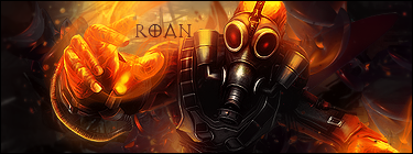
1 avatar by Roan (note: please be patient for it.)
1 avatar by weewee
Tell your friends, tell your guildmates!
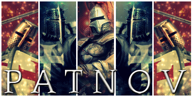
Group 1
A- 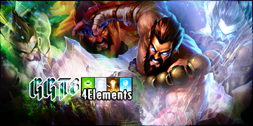
VS
B- 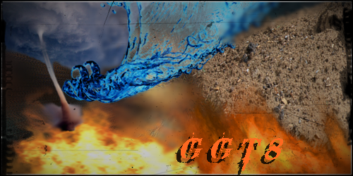
Group 2
A- 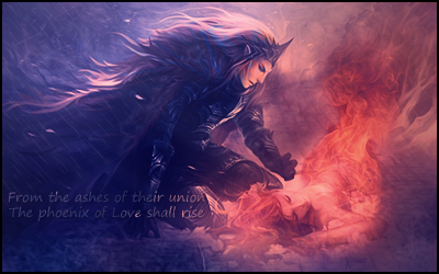
VS
B- 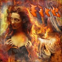
Group 3
A- 
VS
B- 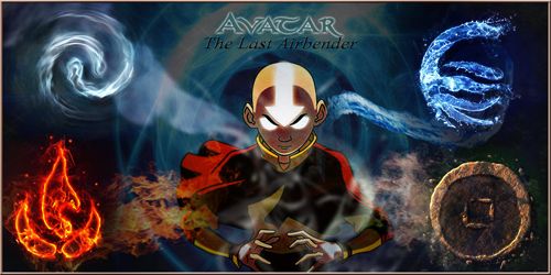
Group 4
A- 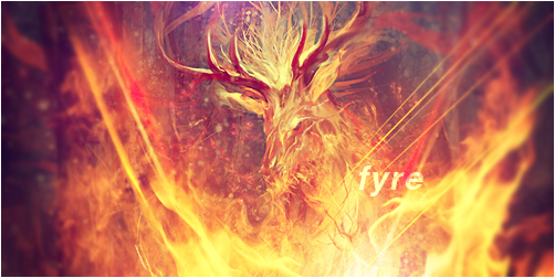
VS
B- 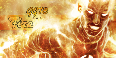
Group 5
A- 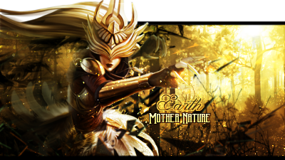
VS
B- 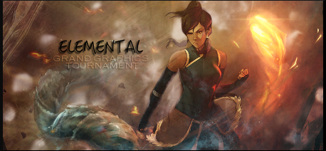
Group 6
A- 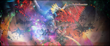
VS
B- 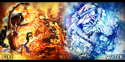
Edited by Roan, 16 November 2014 - 01:49.

 PLEASE ALWAYS KEEP A FOCAL POINT.
  1 mark deducted for the two small sparkles in the bottom left corner and near the text. Apart from that ooohhhhh!! Hello love :*


 At least it have a good concept and good pick of resources. I see you worked on some depth here also.