
Posted 06 February 2015 - 10:39

Posted 06 February 2015 - 20:51
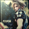
ThxExcellent signature. I'd personally darken the right side of the render and make the lighting more prominent. Smaller text too maybe but that's preference. Nice work.
just wanted to know what details like you mentioned I did wrong so in the future I won't do it
Posted 06 February 2015 - 22:06
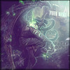
overall its a great sig, personally i would've recolored some of the effects and injected in some orangey-red hues into the piece so it had a more diverse palette. That's the only thing i would add to previous cnc.
Great work, and keep it up matey

Posted 06 February 2015 - 22:14
thx and will pay attention to that in the futureoverall its a great sig, personally i would've recolored some of the effects and injected in some orangey-red hues into the piece so it had a more diverse palette. That's the only thing i would add to previous cnc.
Great work, and keep it up matey
Posted 16 February 2015 - 10:53
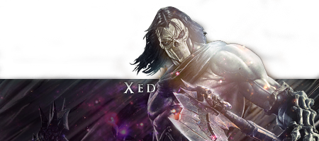
Really nice signature, a few issues though 
Text should be about 2/3 to 1/2 the current size and without the top/bottom lines on it. Also the top left corner should have something in it rather than just the bland background.
Other than the above, it's a super solid piece!
Posted 18 February 2015 - 15:48
Will watch out for that and thxReally nice signature, a few issues though
Text should be about 2/3 to 1/2 the current size and without the top/bottom lines on it. Also the top left corner should have something in it rather than just the bland background.
Other than the above, it's a super solid piece!
Posted 18 February 2015 - 22:57
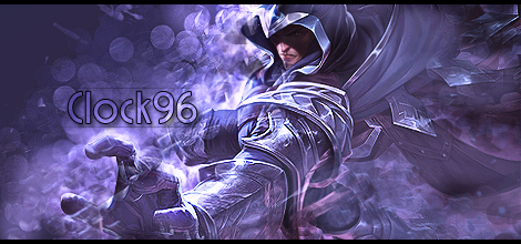
Top right corner of overall siggy and right side of render should be blurred a bit more. It's very monotone and text is too large as mentioned before though.

0 members, 0 guests, 0 anonymous users